The website worked, but didn't convey the center's expertise
The center already had a recognizable website with CT and MRI services, contacts and equipment information. But the structure was more of a business card: no systematic blog, no full profiles for some of the doctors, and an incomplete price list.
For a medical project this is not enough. A patient needs to quickly understand which scan they need, how to prepare, who reads the results, how much the procedure costs and where to turn in an urgent situation.
- there was no dedicated expert content section;
- part of the team had no pages of their own or schema.org;
- the price list was missing items and did not fit well on mobile screens;
- menus and galleries behaved inconsistently across devices;
- new pages needed to be wired into a single SEO infrastructure.
This called not for a cosmetic redesign but for a manageable system: medical content, trust in the team, accurate prices, technical SEO and safe updates to the live site.
What the audit showed: content, trust and data lived separately
We reviewed pages, templates, mobile behavior, metadata, schema.org, the sitemap and the pricing tables. Instead of one big "redesign" we shaped a set of concrete tasks with a verifiable result.
Content gap
Useful answers for patients were not built as search landing pages with FAQ and internal links.
Incomplete price list
The page was missing about 30 items; individual values and the contrast column needed a manual check.
Thin E-E-A-T base
New doctors and part of the administration were not yet presented with full pages and structured data.
Mobile scenarios
The dropdown menu, wide tables, article banners and galleries needed responsive work.
SEO consistency
Every new page had to get a title, description, canonical, Open Graph, hreflang, H1 and the right schema.org type.
Release control
A static site required careful deployment, backups and re-checking live URLs after every stage.
The plan: strengthen every point where a patient makes a decision
Work ran in parallel across content, interface and the technical layer. This avoided the situation where beautiful pages are not indexed or correct data is hard to read.
Launched a medical blog
We built the section page, article cards, a menu item and an expert-article template with FAQ and related posts.
Brought CT and MRI into one system
We expanded the tables, fixed the contrast, synced the homepage and the dedicated price page, then verified every amount on the live site.
Added doctors and administration
Profiles got photos, experience, specialization, galleries, metadata and Physician schema.
Fixed mobile navigation
We unified the header, submenu interaction, 16:9 banners, photo galleries and the behavior of large tables.
Embedded structured data
MedicalWebPage / Article, FAQPage, Physician and BreadcrumbList became part of the templates rather than manual snippets.
QA'd the site after deploy
We checked the sitemap, response codes, visible text, prices, tab switching and the actual render on desktop and mobile.
A blog that answers real patient questions
The first stage launched four foundational articles: the difference between MRI and CT, contrast enhancement, MRI safety and headache. The next step added a detailed article about stroke in Ukrainian and Russian.
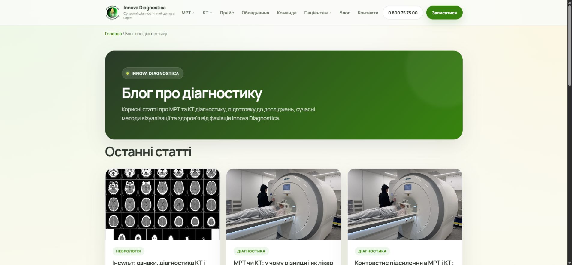
The blog as a standalone search hub. Cards lead to articles with a medical structure, FAQ, breadcrumbs and topical internal linking.
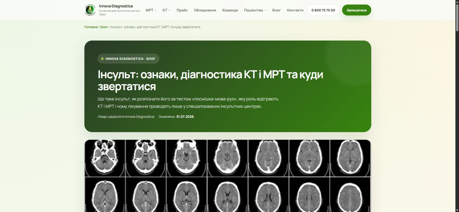
A complex topic in plain language. The stroke article explains the FAST algorithm, the role of CT and MRI, and when to call an ambulance immediately.
117 rows, where an error in a single number has a real cost
We brought the official CT and MRI price lists into a clear structure, added the missing items, highlighted add-on services and contrast, and then updated every amount per the documents effective from 01.08.2026.
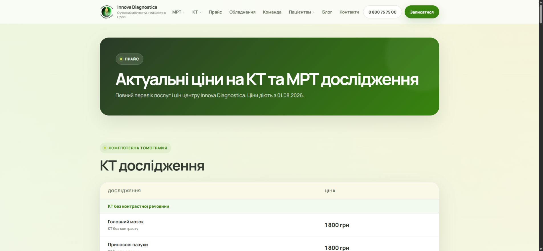
Data verified on the live site. The dedicated price page and the short version on the homepage are in sync; dates and JSON-LD are updated too.
Infrastructure that supports every new page
SEO was not left as a final checklist. Each content type got a clear route from source materials to a verified page inside an indexable site structure.
- unique title and meta description for new pages;
- canonical, hreflang, Open Graph and Twitter Card;
- a single H1, a logical H2-H3 hierarchy and image alt text;
- MedicalWebPage / Article, FAQPage, Physician and BreadcrumbList;
- gzip, caching, async GTM and optimized WebP images;
- an updated sitemap and response-code checks for all public URLs.
Doctors are no longer just names in a list
Three new doctor profiles got a professional bio, experience, specialization, photos, galleries and Physician schema. We also updated the administration block so patients recognize the team before their visit.
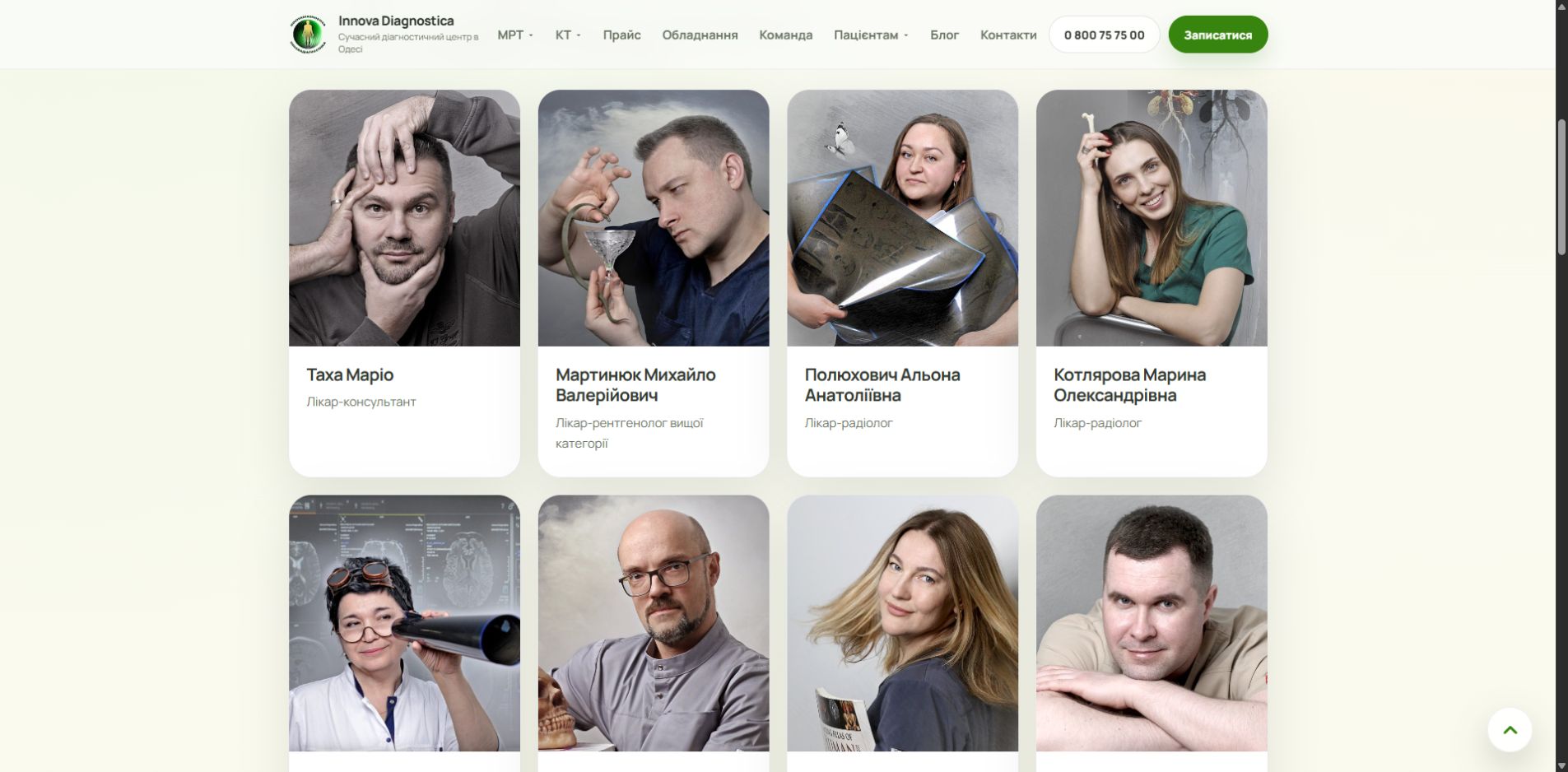
Specialists front and center. The user immediately sees faces, names and specialization; each card leads to a dedicated professional profile.
One interface language — from big screen to phone
We kept the calm medical palette and made the key scenarios prominent: booking, prices, equipment, team and preparation. On mobile, text does not overlap photos, buttons have stable sizes, and tables do not break the page width.
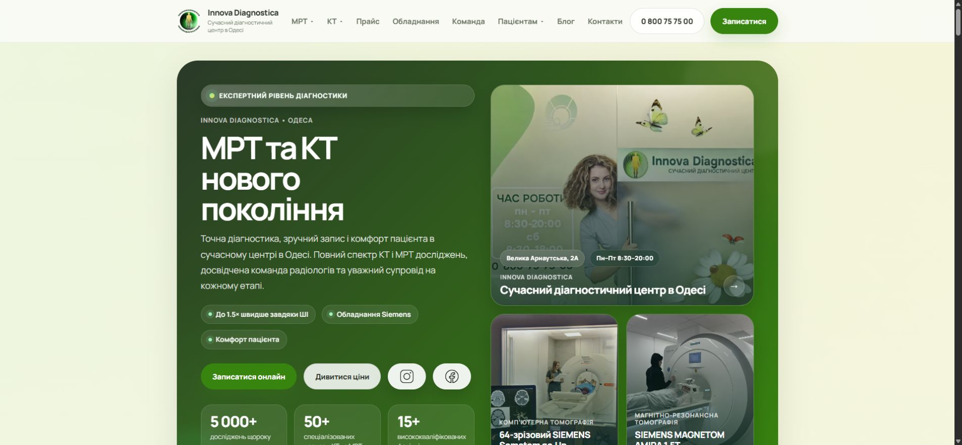
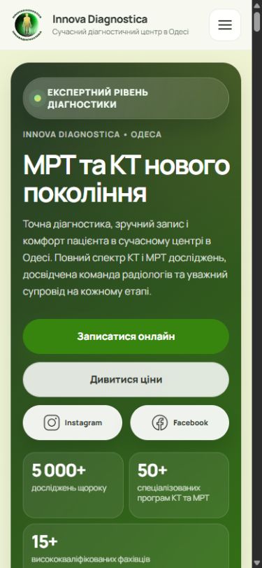
One meaning — two different rhythms. Desktop gives the overview, mobile leads to booking and pricing without extra steps.
Equipment shown as proof, not an abstract promise
The Siemens page explains CT and MRI capabilities through real photos of the center, clear specs and patient benefit. That is stronger than generic talk about "modern technology."
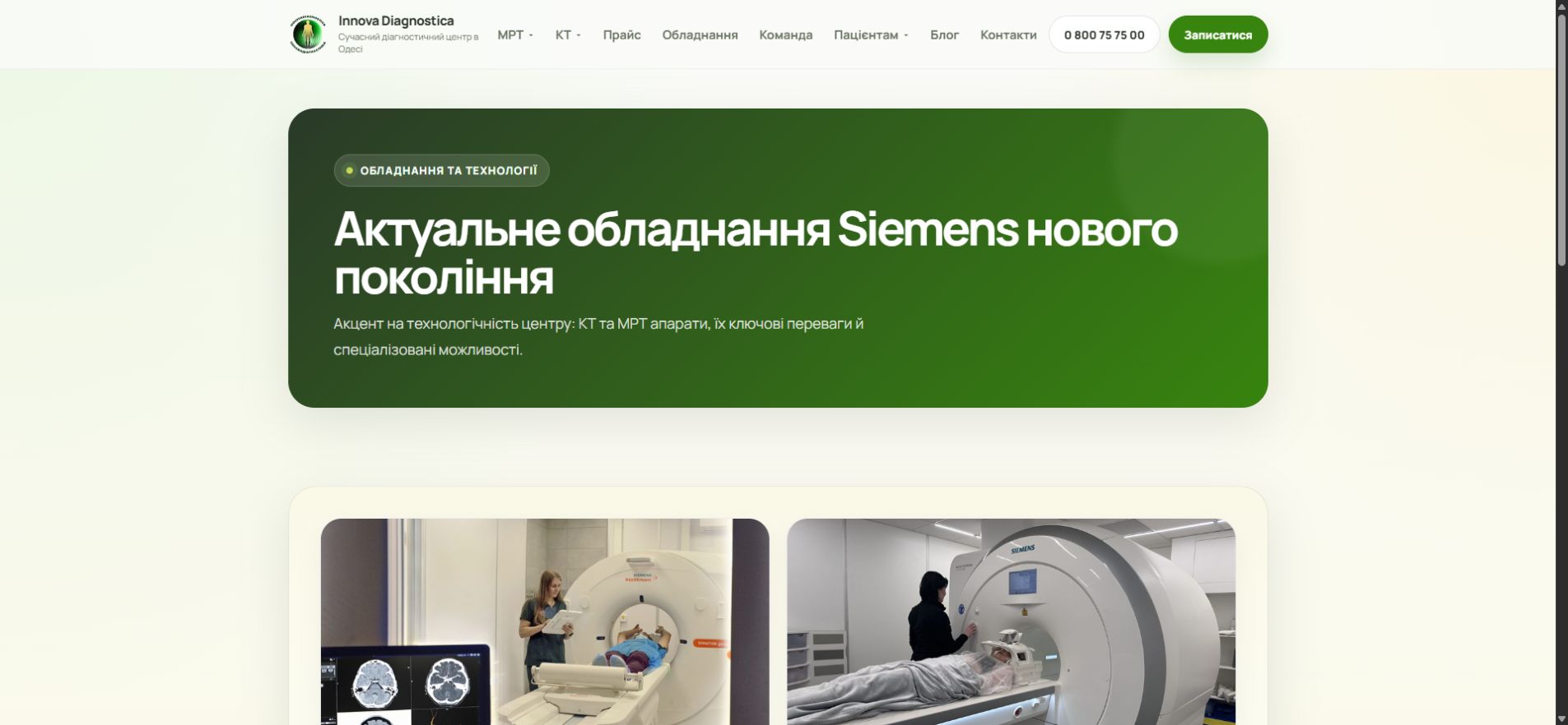
Equipment shown concretely. The patient sees the actual scanners, key specs and the benefits of the scan without abstract advertising promises.
One project — website, content, trust and accurate operational data
Honest about the result: this case study records the completed scope, quality of implementation and the technical state of the project. We do not attribute traffic or lead growth to the site without confirmed Google Search Console and Analytics data.