

YouTube brings us 40% of revenue — and it all starts with the thumbnail
We started filming videos systematically when we understood one simple thing: a client who has watched three of our videos arrives at the call already “warm” — you don’t need to sell, they came to buy. Today video brings SEOquick +40% of all revenue. And the first thing a future client sees is not our content, not our expertise and not even the video title. They see the thumbnail.
of SEOquick’s revenue comes through YouTube content: a viewer watches videos → trusts the expertise → orders the service. The thumbnail is the first touchpoint of that funnel: no click — no view — no client.
Right now we run three channels in three different niches and languages — and on each of them thumbnails are decisive:
- SEOquick — the agency channel with 48K+ subscribers: SEO, AI, podcasts;
- UNmiss — the English-language channel of our AI product: a Western audience and competition with native speakers;
- BeCoin — a project in the trading niche, the very one this story started with.
The story: the designers who couldn’t
When we launched the YouTube direction in the trading niche, the task looked simple: give designers references, get covers. Reality: experienced designers kept sending variants that were impossible to publish — it was a disaster. To the question “what’s wrong?” we heard an honest: “You didn’t give us a clear brief”.
We had to roll up our sleeves. We spent 10 hours on three 15-minute tutorials — dissecting literally every second and collecting examples. We learned Photoshop, drew test covers ourselves and built a brief-scheme that lets any designer make a clickable thumbnail on the first try. This article is that very scheme, plus everything we’ve added to it over years of running three channels.
Our thumbnails: three channels — three jobs
Every cover below is made with the scheme from this article. Click any of them — the video opens and you’ll see the thumbnail “in combat”, in the channel’s real feed:
 SEOquick · 48K+SEO analytics with AI: 5 hours of work in 5 minutesThe numeric promise “5 hours → 5 minutes” + a speaker + the channel’s brand colors
 SEOquick · 48K+SEO is dead: the new GEO strategyThe “opinion against the majority” type: a provocative thesis in big type
 SEOquick · 48K+How to refresh old content with AIA simple headline: the text complements the title, 2–4 words readable from the feed
 UNmiss · ENWhy 90% of Content is Invisible to AIThe big number “90%” is the cover’s main trigger for a Western audience
 UNmiss · ENSEO is Dead — Long Live GEOThe same “against the majority” formula works in any language
 BeCoin · tradingTurned $10 into $556 in under 5 minutesBig numbers + a concrete result — the very niche from our story
What a thumbnail is and what size it should be
A thumbnail (video icon, cover) is the image YouTube shows in the feed, search and recommendations before playback. It is uploaded as a separate image when the video is published.
YouTube’s technical requirements for thumbnails:
The minimum width is 640 px, but upload exactly 1280×720: YouTube scales the cover from a huge TV player down to a tiny card in the mobile feed. Vertical Shorts, Reels and TikTok use the inverted 9:16 ratio — but this article is about classic videos.
One practical nuance: on new channels YouTube may ask you to verify a phone number before unlocking custom thumbnails. It takes a minute in channel settings — do it before publishing your first video.
Design rules: grid, color, font
Every “wow cover” is assembled from three decisions you make once for the whole channel: the element grid, the color palette and the font.
The rule of thirds: where to place objects
The main beginner mistake is elements placed “by eye”. The working alternative is the rule of thirds: a simplified “golden ratio” where the frame is divided into 9 parts by two horizontal and two vertical lines. Important elements go along the lines and at their intersections — the “power points”.
The rule works for regular videos and vertical formats alike. According to our observations (we dissected the TOP-100 videos for popular hashtags), covers built on the thirds grid consistently get higher engagement — niche leaders started at ~3% Engagement. That’s a SEOquick observation, not an academic study, but over the years it has never let us down.
Where should the speaker go? There are blind tests measuring foreground placement: a speaker on the right gets more clicks than on the left. The logic is simple: in the feed the eye moves left to right — text first, then the face.
Color: one working scheme instead of six theoretical ones
The classics teach six color-wheel schemes: complementary, monochrome, split-complementary, analogous, triad, tetrad. Useful to know, but one working scheme is enough for a channel:
- Pick the channel’s primary color — the brand color (green was our trading client’s channel color; SEOquick’s is violet).
- Add a neutral base: white, black and 50% gray.
- Take the opposite color on the wheel — the accent for the most important elements.
- Change the glow, not the palette. So that videos in one palette don’t blur together, vary the glow shades around the text: a shadow under the letters, a bright glow via Gaussian blur, an inner shadow for volume.
Font: one per channel — forever
It’s easy to burn weeks picking a font. Let’s narrow it down: the Eastman family by Zetafonts (official page) looks great in almost any thumbnail — bold, geometric, readable at any size. Alternatives proven on thousands of covers:
The rules are the same for any font: 2–4 words, letter height at least a third of the frame, bold weight, an outline or glow for contrast with the background. Thumbnail text must complement the title, not duplicate it — crafting the title itself is covered in our article on the catchy Title.
Your channel films, but views don’t grow?
We’ll audit your YouTube: content, thumbnails, titles, tags — and show where the clicks leak away.
How to make a thumbnail: a step-by-step guide
The scheme below is the very brief we built after 10 hours of dissecting other people’s tutorials. The main tool is Photoshop (some effects can’t be replicated without it), but the logic works in any editor — from Canva to Figma.
- Turn on the thirds grid
“View → New Guide Layout” → 3 columns, 3 rows. This is the skeleton of the whole composition.
- Assemble the image skeleton
Background, speaker (on the right!), text area on the left third. Big blocks first — details later.
- Add text and effects
Your chosen font + layer effects: bevel, stroke, drop shadow, inner shadow, inner glow. Save the layer style you create — it becomes the channel’s signature.
- Process the background
The background must not compete with the text. Working techniques: darkening (a semi-transparent black layer or a brush), distortion/stretching, Gaussian blur, mosaic, motion blur. Any of them shifts focus to what matters.
- Fix the text color
If the color doesn’t “sit” on the background: “Adjustments → Hue/Saturation” → check “Colorize” and “Preview” — and tune it to the channel palette.
- Add one visual trigger
An arrow, a circle or a pointing finger directs the eye to the key element. The rule: a trigger is needed when there are many elements. If the cover already has a single object — the arrow is redundant.
- Check the speaker’s emotion and sharpness
There’s no clear “smile vs shock” correlation — but a sharp, crisp face always beats a caricature emotion. Leave the cringe grimaces to competitors.
- Run it through thumbsup.tv
The free service thumbsup.tv shows the cover inside the YouTube interface: day/night, desktop/mobile, home page/channel page. Tiny details and broken proportions are visible immediately — never hand off work without this check.
10 types of clickable thumbnails
All YouTube covers are assembled from 10 recurring formulas. You won’t make every cover identical — so here is the full catalog: combine 2–3 types and alternate them.
1Simple headlinebasics
Big text that complements the video title (doesn’t repeat it!) + a speaker in the right corner + a recognizable background. The most common and most reliable type.
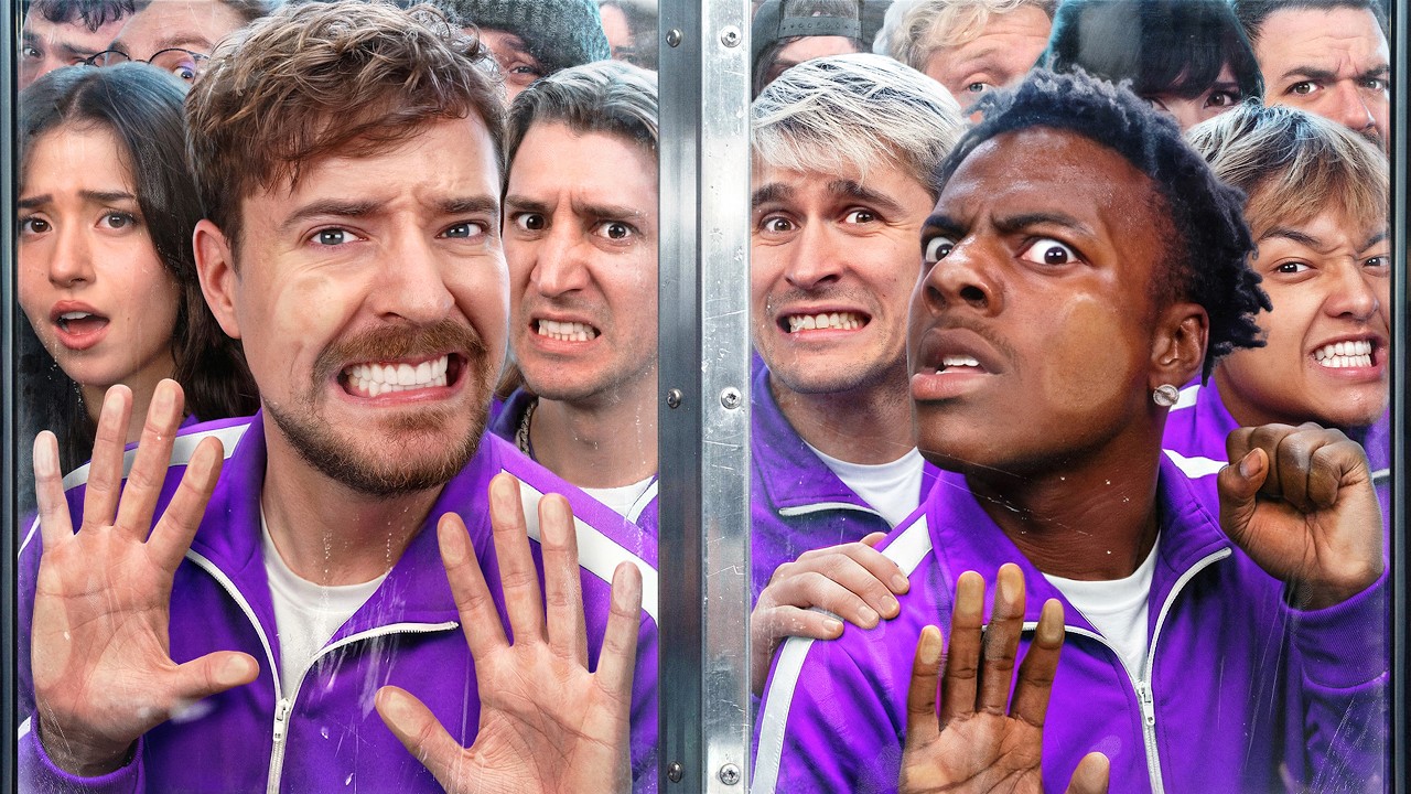
2Shocking thumbnailcareful
The MrBeast move: the most shocking scene of the video, hyperbolized — the “hey, what are you doing?!” reaction. Works outside entertainment niches too.
3Big numbersbasics
“A $50,000,000 house”, “+1,500% in a month”. Specific result numbers consistently beat covers without them. An irritated emotion + a number works better than a positive one.
4Simplicitycontrast
Minimal elements: a speaker, an object, done. Against competitors’ overloaded covers, an “empty” thumbnail wins by contrast.
5Comparisonbasics
Android vs iPhone, before/after, cheap vs expensive. The most worn-out — and still working — curiosity trigger.
6Social hackingcareful
A small channel and a face nobody knows? Use the face of the person you review: discussing a MrBeast challenge — his face legitimately works for your CTR. Just don’t lie about the content.
7Blur intriguecareful
Blur or mask the key element or the result — the viewer clicks to find out. Important: hide a detail, not the video’s topic, otherwise CTR grows while retention crashes.
8Weird designrare
Disgusting, disturbing or absurd visuals + a single alarming word. A strong but single-use move for hype topics — you can’t exploit it constantly.
9Size juxtapositionniche
The blogger next to the object at real scale. Travel bloggers’ favorite; in other niches an honest “non-staged” photo works instead of montage.
10Question in the textbasics
A screenshot of the moment + a clearly visible question “what’s going on here?”. Great for streams and podcasts with no staged shot.
A masterclass from MrBeast: real covers of the #1 channel
MrBeast — 400M+ subscribers and a team that makes up to 20 cover variants per video. Look at his real thumbnails and notice how each one uses techniques from the catalog above:
 MrBeastAges 1–100 Race For $250,000!Big numbers + comparison: a hundred faces and the prize sum — two triggers in one frame
 MrBeast$1 vs $1,000,000,000 Futuristic Tech!Pure “comparison”: cheap vs expensive — the contrast reads even in a mini card
 MrBeast7 Days Stranded in The ArcticShock + emotion: a hyperbolized scene from the video, a readable-emotion face on a power point
 MrBeast50 Streamers Fight for $1,000,000Social hacking: famous streamers’ faces + a big prize number
The common denominator of all his covers: minimal text (or none), one clear scene, saturated colors, a readable emotion — and a mandatory check at mobile-card size. Expensive sets are secondary: the formulas are the same as in the catalog above.
Strategy: brand, signature and anti-cliché protection
Don’t copy the top of the results
Every creator’s first idea is to look at competitors and “paste their own head in place of another speaker”. Everyone does it — which is why YouTube results for major queries look identical: the cliched icons effect appears and the speaker’s personality drowns in it. The viewer files you under “copying yet another blogger” and scrolls past.
The working antidote is taking ideas from other niches. The skeleton of a popular cover from the cooking niche, moved into finance, gives a double effect: the construction is already view-proven, and nobody in your niche does it.
Branding
Experiments are great, but colors, font and style must be unified across the channel. A recognizable style is accumulated CTR: the audience clicks “their” covers in the feed before reading the title. The same single-style principle applies to the channel header (article in Russian).
Choosing the words
- Big numbers — “×7 in 6 months”;
- A statement — “This kills your CTR”;
- An opinion against the majority — “SEO is not dead”;
- A provocative question — “Why do you film like this?”;
- A short headline — 2–4 words complementing the Title;
- No text at all — for the “simplicity” type.
These same wordings are the core of a designer brief. How to brief contractors so you don’t get the “disaster” from our story — in our guide on the technical brief.
Testing: let YouTube pick the best cover itself
No more guessing: the Test & Compare feature in YouTube Studio lets you upload up to three thumbnail variants per video — YouTube shows them to different viewers and picks the winner by watch-time share.
How to use it systematically:
- upload three variants (for example, different types from the catalog above);
- wait for YouTube to collect statistics — usually up to two weeks;
- check the result on the video details page: YouTube keeps the winner automatically, but you can swap it manually.
Metric benchmark: a normal thumbnail CTR for most channels is 2% to 10% (YouTube Analytics data); the range depends on the niche and on where the video is shown. CTR is a signal for the recommendation system: when viewers see the cover but don’t click, reach drops. The thumbnail + the title + the right tags and keywords are the three levers you fully control.
Services and AI: where to make thumbnails without a designer
Photoshop is the most flexible route, but not the only one. Working alternatives with ready-made 1280×720 templates:
Canvafree plan
Thousands of thumbnail templates + AI features: background generation, speaker background removal, Magic Resize for formats. canva.com
Adobe Expressfree plan
Templates + brand kits, quick background removal. The closest you get to Photoshop without Photoshop. adobe.com/express
Fotor / Pixlrfree plans
Light online editors with thumbnail templates and basic AI tools — for when you need it “fast and with no install”. fotor.com · pixlr.com
Snappa / PicMonkey / Placeit
Template builders for streaming cover production — when you need 20 thumbnails a week in one style. snappa.com
Checklist: 7 checks for a finished thumbnail
- Size and format. 1280×720, 16:9, JPG/PNG, up to 2 MB.
- Thirds grid. Key elements on the lines and power points, speaker on the right.
- Text. 2–4 words, complements the title, readable on a phone at arm’s length.
- Palette. Brand color + a neutral base + one accent. The background is darkened/blurred and doesn’t fight the text.
- One trigger. Arrow/circle/finger — only if there are many elements. The video’s topic is visible; only the intrigue is hidden.
- thumbsup.tv. The cover is checked in day/night, desktop/mobile, home/channel views.
- Test. 3 variants uploaded to Test & Compare — viewers decide, not the designer’s taste.
In short: the clickable thumbnail system
- The thumbnail decides the click. 90% of top videos use custom covers; normal CTR is 2–10%, and every extra percent means reach growth through recommendations.
- Three decisions made once: the thirds grid, the “brand + base + accent” palette, one font per channel.
- 10 cover types cover everything: combine 2–3, keep a series of 5 videos, then refresh one element.
- Don’t copy your own niche — take constructions from other niches and adapt them to your brand.
- Test, don’t guess: thumbsup.tv before publishing, Test & Compare after. Data always beats taste.
If you want thumbnails, titles and channel strategy to work as one system — check our YouTube promotion service and the full video promotion checklist.
Data sources
- YouTube Help — the “90% of the best-performing videos use custom thumbnails” stat and cover guidelines: Thumbnail & title tips; technical requirements (1280×720, 16:9, 2 MB): Add video thumbnails; the 2–10% CTR range: Impressions and CTR.
- Social Media Today — a breakdown of the MrBeast team’s process (up to $10,000 and ~20 variants per cover, as told by the team in a YouTube interview): How MrBeast's team creates thumbnails.
- Zetafonts — the Eastman font: zetafonts.com/eastman; thumbsup.tv — thumbnail preview inside the YouTube interface: thumbsup.tv.
The “+40% of revenue through YouTube content” figure is SEOquick’s internal deal-source data. Observations on the rule of thirds and engagement (~3%+ Engagement among the TOP-100 hashtag videos), the speaker on the right and the cliched icons effect are SEOquick’s practice on the SEOquick, UNmiss and BeCoin, channels, not academic studies. The story about the designers and 10 hours of tutorial dissection is the team’s real experience. Thumbnails in the galleries load directly from YouTube (YouTube CDN) and stay current.