TOP 10 Blocks for a Landing Page: The Structure of a Selling
What is a landing page and how do you build an effective structure? How to make a landing page correctly: interactive elements and secret tricks.
Everything you need to know about the structure of an effective landing page, in one article.
The subtleties and tricks of a single-page site that increase conversion.
If you want your landing page to sell 24/7, you're in the right place.
Let's figure out why you should study the effective structure of a landing page.
A landing page can become both a faithful helper and a loss-making investment.
It all depends on how competently the structure of the single-page site is developed, and how effectively it conveys meaning to your target audience.
You'll only be able to confirm this after a test launch of an ad campaign and tracking the data (using Yandex.Metrica and other tools).
To save you from wasting your ad budget and development funds, let's look at what an effective landing page should look like.
Read on and stay in the loop!

Hey! Yes, you. Looking for traffic to your site? SEOquick will bring you 100% organic!
SEO is your long-term and reliable source of traffic from the Google and Bing search engines
We'll deliver comprehensive SEO promotion: content, reputation, on-page optimization, link building
Our SEO is white-hat, and our goal is to get you into the TOP! We know exactly what to do and how. That's exactly what you need, isn't it?
What Is a Landing Page?
How does a landing page differ from a website?
What are its main objectives?
The structural features of a landing page.
You're probably already aware of what a landing page is.
Just in case, let's repeat once more that a landing page is a single-page site with a special structure built on the basis of marketing technologies.
It's no secret that it's now practically impossible to sell anything to a modern internet user right away.
It's important to grab their attention, dive into their problem and find a solution, then handle objections, motivate them to buy, and offer some free bonus (or a lead magnet) in exchange for their contact details.
Well, this is exactly the task a landing page handles perfectly.
A landing page contains a specific set of blocks arranged in a logically correct (from a marketing standpoint) sequence.
Thanks to this, the user receives information in portions, which minimizes the risk of distracting factors and, consequently, abandonment.
Unlike a regular website, a landing-page site is a great opportunity to convey your advantages through pinpoint focusing.
A single-page site skillfully manages the potential customer's attention.
For this, it features special triggers, which we'll talk about further on.
How do landing pages differ?
- they have a special structure built on the basis of marketing technologies;
- they let you focus the user's attention where it's needed;
- they reflect your advantages and hide your shortcomings;
- they let you differentiate yourself from competitors;
- they encourage the visitor to take a target action (leave a request or call).
This is far from a complete list of a landing page's advantages.
At the same time, you can't say that it works better or worse than a regular corporate website.
Do you want to get free traffic?
Are you interested in promoting your site?
Fill out the form below and I'll personally get in touch with you, and we'll discuss a plan for growing your business!
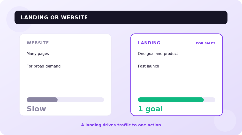
Landing Page or Website — Which to Choose?
What's the difference between a website and an LP?
The main functions of a landing page and a website.
Can they be used together?
You shouldn't compare a proper landing page and a website.
These are completely different tools that perform completely different functions.
A website is primarily used to represent an organization online.
That is, it performs informational and representational functions.
It's hard to imagine a large organization that uses only a landing page to position itself online.
That would be fundamentally wrong, since a single-page site doesn't fully reflect the full scale of the situation.
With a corporate website you can:
- present comprehensive information about services, employees, production facilities, the company's corporate life, etc.;
- increase trust in the eyes of buyers and partners;
- emphasize the seriousness and status of the organization.
In turn, a good landing page is aimed at solving one specific task.
That's why it doesn't allow attention to lose focus.
The main goal of a landing page:
- To reflect the advantage of your service / product offering.
- To set you apart from competitors.
- To handle the potential customer's objections.
- To motivate them to perform the target action.
Important: ideally, a landing page is used to promote one type of product or one service. In this case, you can achieve the maximum result.
Thus, it's impossible to give an unambiguous answer to the question of what to use — a landing page or a website.
Ideally, make a representative corporate website and several single-page sites for different services, to which you precisely attract potential customers in order to fully address their needs.
Recommended reading:
The Effective Structure of a Landing Page: The Main Blocks
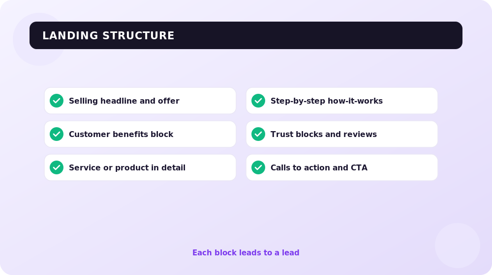
The blocks on a landing page that increase conversion.
What does a selling single-page site consist of?
Secret life hacks for creating each block.
Some business owners mistakenly believe that a landing page's design plays the primary role in its effectiveness.
However, this isn't so. The "selling power" of a single-page site is determined by its structure and meaning.
Of course, graphics make it easier to perceive information, especially if they're developed with all the rules of UX in mind.
But in the absence of a competent structure and quality sales copy, a landing page is doomed to fail.
And that means no matter how much you invest in advertising, the result will still be zero.
Unfortunately, many clients know what a landing page is, but have no idea what blocks a single-page site should actually contain to truly sell.
Now we'll solve this problem once and for all.
Important to know: depending on the business field, as well as the goals and objectives set, the structure of a landing page may differ somewhat. However, there's a basic set of blocks that a landing-page site must contain without fail. So, let's go.
The Selling Headline
From the moment a customer lands on your page, you have only 2-3 seconds to grab their attention.
Otherwise they'll simply click the X and go searching further.
It's precisely for this purpose that a selling headline (the offer) is used on the first screen.
Remember that a landing-page site is, above all, a selling tool.
That's why the headline's main task is to reflect your unique selling proposition (USP).
Essentially, this is what sets you apart from competitors and emphasizes your unique advantage.
Many experts claim that the headline alone determines 50% of a landing page's success.
That's why it's extremely important to pay attention to it.
Important: to form a USP, you first need to create a portrait of your target audience (identify the pains and needs of your potential customer). You also need to analyze your competitors. This, as a rule, should be handled by a marketer.
However, if you don't have a marketer, you can use the simple 4U formula to form a USP.
The 4U formula:
- Usefulness — indicate how your product/service is useful to the potential customer.
- Uniqueness — show how you differ from competitors (perhaps it's a new approach to work or the use of innovative technologies).
- Urgency — show the customer how soon they'll be able to solve their problem with your service.
- Ultra Specificity — point out some "twist" that you use in your work with the customer.
It's not necessary for all 4 components to be present in the headline at the same time.
A unique selling proposition should be concise, succinct, and clear.
Example of a headline using the 4U technique: "Save up to 40% on wall finishing with architectural elements made of fiber concrete."
The Benefits Block
If you want your landing-page site to sell, be sure to place a benefits block on it.
This element consists of small paragraphs (bullets), each backed by an icon or image (corresponding to the meaning of the text), and also containing a heading (reflecting the main idea).
Important: you can place two benefits blocks on a landing page at once — the first reflecting the specific advantages of the product or service (measurable metrics), and the second the advantages of cooperating with you (delivery terms, payment, guarantees, etc.).
A Life Hack for Creating the Benefits Block
Open several landing pages in your niche.
You'll surely see ordinary phrases there, such as: the best product, low prices, flexible terms, a wide range, an individual approach, high quality, etc.
Using such phrases is strictly forbidden — of course, if you want your landing-page site to truly sell.
The more specifics you show in the benefits block, the better:
- Provide concrete figures (if it's a discount — then how many %, if it's employee experience — then how many years, if it's a guarantee — then on what terms).
- Use the AIDA technique (in the bullets, reflect not your advantage, but the direct benefit the customer will get from using your product or service).
Example of a good bullet in the benefits block: "SAVINGS UP TO 15%. When ordering a package of services, you get a discount of up to 15%. This is possible thanks to the optimization of engineers' work processes and the efficient use of equipment."
The "Service/Product in Detail" Block
Present your service or product in detail.
Describe how it addresses the needs of your potential customer.
Specify the key characteristics or features of how it's provided.
The more product information you reflect, the better.
Important: once again we draw your attention to the fact that a landing page should be focused on one type of product or one service. Entrepreneurs often don't want to make several landing pages for different USPs to save money. The result is disappointment and a wasted ad budget.
At the same time, if you have several sub-services within one service, you can safely place them on the landing page.
In doing so, it's advisable to add [More] buttons leading to pop-ups (popup windows) with additional information.
The "Distinctive Advantage" Block
Recall the previous benefits block containing several advantages.
In it, each bullet was responsible for a specific advantage and was backed by graphics.
Several such bullets (4-6 of them) were placed on the screen.
In the "Distinctive Advantage" block, we act on a similar principle.
The only difference is that we describe 1 specific advantage on 1 screen.
As you've probably guessed, this should be something extremely important, worthy of your potential customers' attention.
There can be several such screens with advantages.
It's better to dedicate one screen to each of them (if they're truly valuable) so as not to overload the page.
However, don't overdo it. It's better to place all ordinary information in bullets.
At the same time, you shouldn't be afraid that the landing page will turn out too long.
According to statistics, detailed, extensive single-page sites with a thorough description bring in 220% more potential customers.
The Workflow Diagram
It might seem like an ordinary block, but it's an extremely valuable one.
The workflow diagram briefly but succinctly describes the entire process of cooperation with the customer — from the moment a request is left on the capture page to obtaining a concrete result.
A life hack for creating a workflow diagram: at the final point of the workflow diagram, indicate the benefit of using your product or service (the very one you describe in your USP). This should work as a trigger.
Don't forget that the workflow diagram should be concise.
It's best to present it as a structured list.
Trust Blocks
If a customer who hasn't encountered your product before and is generally hearing about you for the first time lands on your page, they'll inevitably have doubts.
To dispel them, special trust blocks are used.
Customer reviews:
Client/partner logos:
Product certificates:
Life hack: these days it's hard to earn a customer's trust, since text reviews barely work anymore, and logos don't impress many people either. When possible, ask customers to provide thank-you letters in the form of scans or videos.
The "Pain-Solution" Block
At the very beginning, when landing pages were just starting to appear on the market, the "pain-solution" block was extremely popular and was used on practically every single-page site.
It featured roughly this kind of information: "Tired of feeling discomfort? Can't cope with the problem on your own? Don't like your figure (a series of trite but tricky questions) — then use our 'magic' pill and you'll be happy."
The problem is that people are extremely tired of this kind of statement; they already know about their problems.
So, seeing a single-page landing with such statements, they simply close it without a second glance.
However, if you really do have something to "scare" your potential customer with, why not.
Just do it carefully, and at the end delicately place a call to action in the format: "Entrust the matter to professionals / use our product / service to avoid such mistakes / such problems."
Important: if you want to make a landing page, think about the "pain-solution" block in advance and tell your developer about it, so that together you can decide how to organically fit it into the overall structure if needed.
Calls to Action and CTA Elements
Upon landing on the page, the user should clearly know what to do at a given moment in time.
For this, a call to action should follow each block on the landing page:
- Get a free sample or catalog (after the product block).
- Avoid the mistakes shown in the example and use your consultation (after the "pain-solution" block), etc.
It's important for the call to action to match the meanings conveyed in the block and to once again emphasize the benefit the customer will get from using your product.
If you're wondering how to make a landing page, also pay attention to CTA elements, or, simply put, buttons.
It's advisable to place them under each call to action after each logical block (that is, 1 button per screen).
Life hack: place a call to action on the button that briefly duplicates the main call to action. For example, if you're prompting people to get a consultation, write exactly that on the button [Get a Consultation], not the trite [Leave a Request].
The Request Form
The request form is a mandatory element on a landing page, through which the user can leave their contact details (email, phone, comment, etc.).
Previously it was considered good practice to place a feedback form in two places at once: at the top of the landing page (under the service description block) and at the very end.
Now CTA elements on each screen are quite enough, so you can limit yourself to a single request form at the end.
The Menu
According to statistics, 84% of landing pages have navigation (a menu that lets the user easily find the information they need).
Foreign marketers consider a menu on a landing page bad practice, since it gives the visitor the freedom to choose — where and when to navigate.
And this reduces the effectiveness of the landing page's conversion funnel.
However, only 16% of landing pages have no navigation.
A Proper Landing Page: Additional Blocks
TOP 6 additional blocks.
Interactive elements and secret tricks.
How to make a single-page site special?
Once again we draw your attention to the fact that, depending on the needs of the business and the specific field, the structure of a single-page site may change.
What works effectively in one case may be completely ineffective in another.
That's why many entrepreneurs make the mistake of copying landing pages.
Depending on the task set, the following additional blocks may be incorporated into a landing page's structure:
Quiz
A quiz is an interactive element that increases the loyalty of landing page visitors.
As a rule, it's presented in the form of a thematic test (related to the landing page's chosen subject).
Let's say the user is asked to answer 4 simple questions and get a personal offer / calculation / product tester, etc.
As you may have guessed, a quiz is used to obtain potential customers' contact details for the purpose of subsequently processing them and converting them into a sale.
3D Tour
Give users the opportunity to immerse themselves in an online journey.
Show what your office, production facility, etc. look like.
This will increase visitors' trust and loyalty.
Video
Show how to use your product, or demonstrate how you provide your service.
According to statistics, in some cases adding video to an LP can increase conversion by 86%.
The "About the Company" Block
In some cases, it's relevant to place a small "about the company" block on a landing page.
This often applies to the b2b segment (business to business), which is focused on corporate clients.
In this case, a small "about the company" block can be used to increase loyalty.
As a rule, it consists of an image and several paragraphs of text designed to tell about the company.
When creating this block:
- Use only facts (avoid ordinary phrases: an individual approach, high quality).
- Provide key information (how many years on the market, what makes you special, what technologies you use).
- Be concise (just 2-3 paragraphs will be enough).
The "Us in Numbers" Block
Recently this block has lost its former popularity, since it's used too often on landing pages.
Companies place an "N facts about us" block simply because "it's expected."
After all, according to statistics, users more often read texts that contain numbers.
However, you shouldn't overuse this block.
Customers aren't interested in reading facts that have nothing to do with the product or service.
Roughly speaking, a law firm has no reason to write how many sheets of paper it spent on contracts with clients, but indicating the number of cases won in court is quite relevant.
The "Question-Answer" Block
Answer customers' most common questions to handle their objections on the landing page.
How to Make a Landing Page?
Do it yourself or turn to an agency?
The process of developing a single-page site.
Recommendations for creating an LP.
Now you know exactly what landing pages are and what an effective single-page site should look like.
Let's figure out how to make a landing page.
Here you can take one of two paths: entrust the matter to a developer or build it yourself (on a control panel or builder).
In the first case, you'll most likely get a more professional execution, although here everything depends on the developer's level and reliability, as well as the project's budget.
Ideally, before starting to create a landing page, an agency conducts marketing analysis without fail, creates a portrait of the target audience, and forms the USP.
Then the following is carried out:
- developing the structure (prototyping);
- creating the sales copy;
- rendering the design;
- coding and connecting the control panel;
- testing.
You can find out approximately how much it costs to make a website here.
If you've nonetheless decided to create a landing page yourself, be sure to study the best selling single-page sites, conduct a basic competitor analysis, and try to create a structure following the recommendations from our article.
For simple and fast assembly, you can use a builder — for example, a Wix landing page.
Conclusions
A single-page landing page will be genuinely selling only on the condition that a competent structure is developed.
It's the structure that's responsible for managing the user's attention, handling their objections, increasing trust, and motivating them to perform the target action.
No matter how cool the design of a landing page is, without a competent conveyance of meaning, it won't work.
Use our recommendations to create a truly effective single-page site and increase sales.
Share your experience of using landing pages in the comments!
Link Building in Simple Words: Where to Get Permanent Links and How to Promote a Site with Links in 2026
Link building in simple words from a practitioner since 2008: how permanent links differ from rented links, why the black-hat SEO era is over, white-hat methods with examples, internal linking, AI-assisted link building, and sources.
Read →Google Ads Keywords in 2026: Research, Match Types, Negative Keywords
How Google Ads keywords actually work in 2026: real match type behavior, keyword research, campaign structure, negative keywords and PMax.
Read →Performance Max for an Online Store: A Setup and Optimization Case Study
How to set up Performance Max for an online store: a case study with ROAS growth from 2.8 to 5.1, the Merchant Center feed, asset groups, budget and optimization.
Read →Want to apply this to your site?
We will review the current situation, find the first growth levers, and suggest a practical working format.